Your basket is empty.
Look like you haven't added anything to your cart
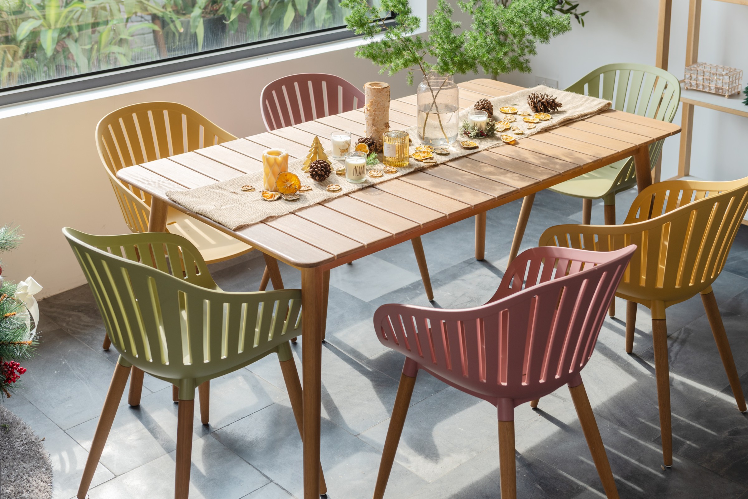
Despite the bright fresh start associated with the New Year, January can be a bit of a dismal month, and it really does seem to drag, so why not get playful with colour in your home and garden this month and use the science behind the shades to help tailor the space to your mood? Whether you want to create a sense of calm, stimulate your mind, boost energy levels, promote a nurturing environment, or fashion a room that brings people together, there is a palette or hue to help you do just that.
Colours and the emotive or even physical responses we have to them can be explained by simple psychology. Whilst different colours have varying significances across different cultures, there are certain colours that hold universal meanings, such as red, for example, which many associate with fire and a warning. It is a colour that can make our heart race and evoke powerful emotions, as opposed to the calming effect of blue, which we tend to associate with the sky and cool temperatures.
So, how can you harness this science and elicit the feelings you want in your own home?
Blue is described as a stable colour and exposure to this colour can promote a sense of peacefulness and tranquillity. It is also the colour of trust and suggests loyalty and integrity, helping to ease tension and fear. As it is a cool colour, it creates a sense of openness and space. Calming pastel shades are very much on trend right now, so if you’re looking for a stylish calming combo, try teaming dusty blue with nurturing blush pink. This is a favoured palette for bathrooms in 2021/22, as people set out to create relaxing environments.
Did you know that some sports teams even use the tranquilizing effect of dusky pink to help get an edge over the opposition? Apparently, guest locker rooms are painted in the colour because it is known to drain energy. It does, however, make it an ideal colour for meditation rooms and bedrooms.
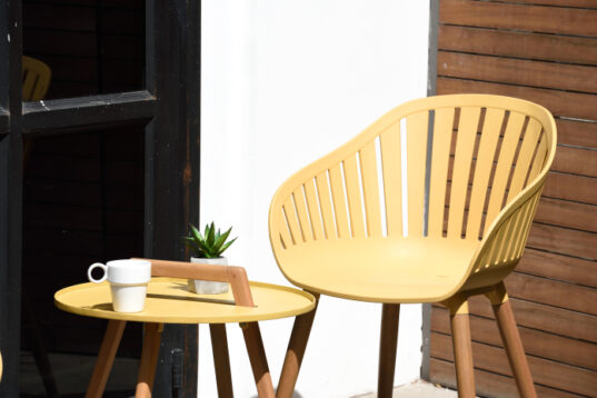
On the opposite side of the colour wheel is yellow, the colour of optimism, brightness and mental clarity. It is associated with happiness, vibrancy and creativity. Designers have seen people ditching whites and creams and embracing bright, joyful, citrus colours, with pops of yellow or orange.
Orange radiates warmth. It is an inviting colour that evokes feelings of happiness and sociability. It is where the urgency of red meets the cheerfulness of yellow, meaning it has a stimulating effect, particularly on the appetite, so works wonders in kitchens and dining rooms; encouraging people to gather together and eat.
Orange radiates warmth. It is an inviting colour that evokes feelings of happiness and sociability. It is where the urgency of red meets the cheerfulness of yellow, meaning it has a stimulating effect, particularly on the appetite, so works wonders in kitchens and dining rooms; encouraging people to gather together and eat.
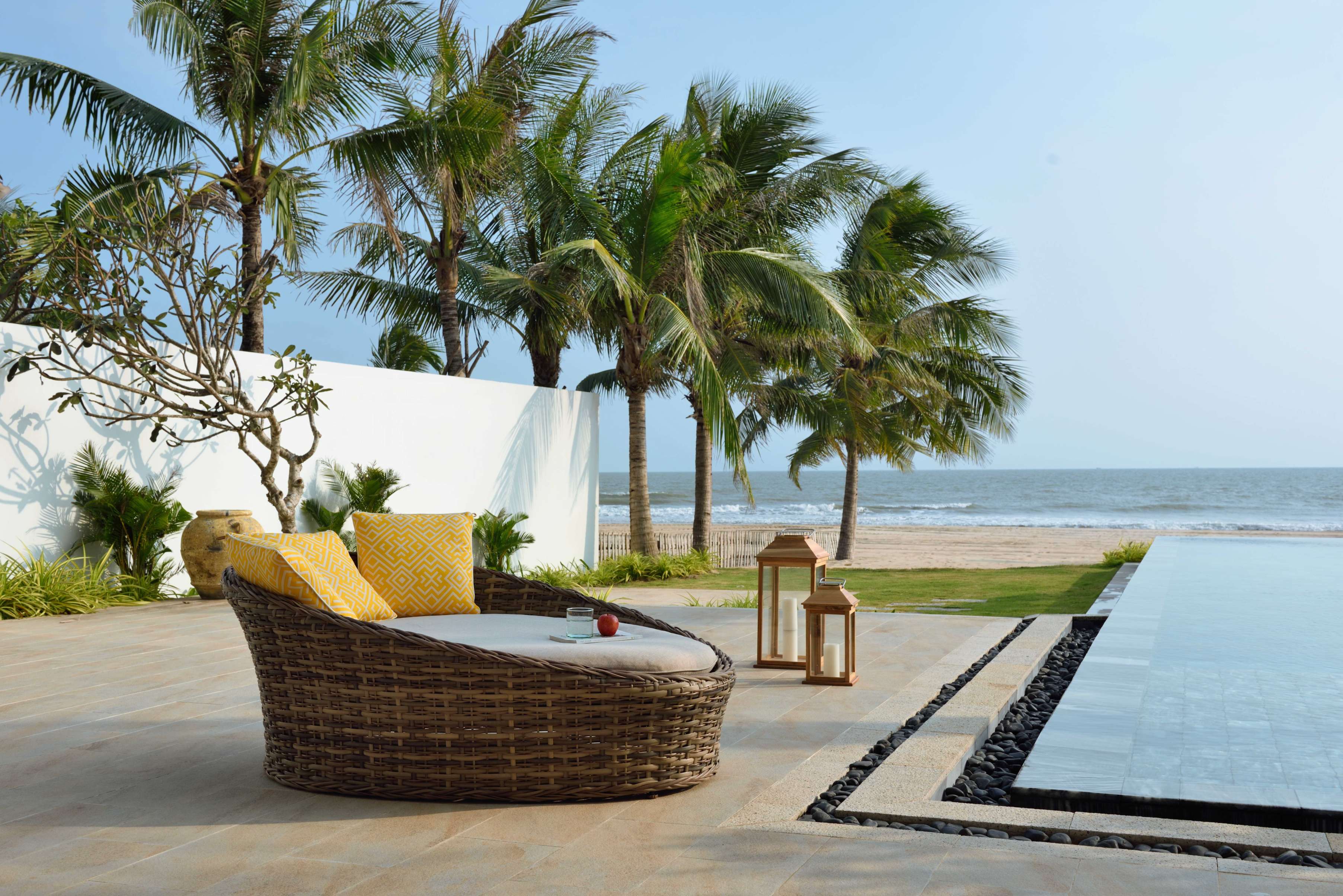
As a result of the pandemic, people have naturally been drawn towards the hopefulness and energy of yellow, so it was no surprise when Pantone named the vibrant shade ‘Illuminating’ as one of its Colours of the Year in 2021. The graphic colour specialist partnered the jovial yellow hue with ‘Ultimate Grey’ as a palette that is both uplifting and enduring. So, whether you go for bold sunshine yellow or a soft lemon tone, this colour will bring energy and cheer into your home and garden, whilst working wonders with the shades of grey that have been household staples in décor schemes for some years now.
Don’t go overboard though, as too much yellow on the walls can be overstimulating and have a negative effect. There’s a reason babies were found to cry more in sunny yellow rooms!
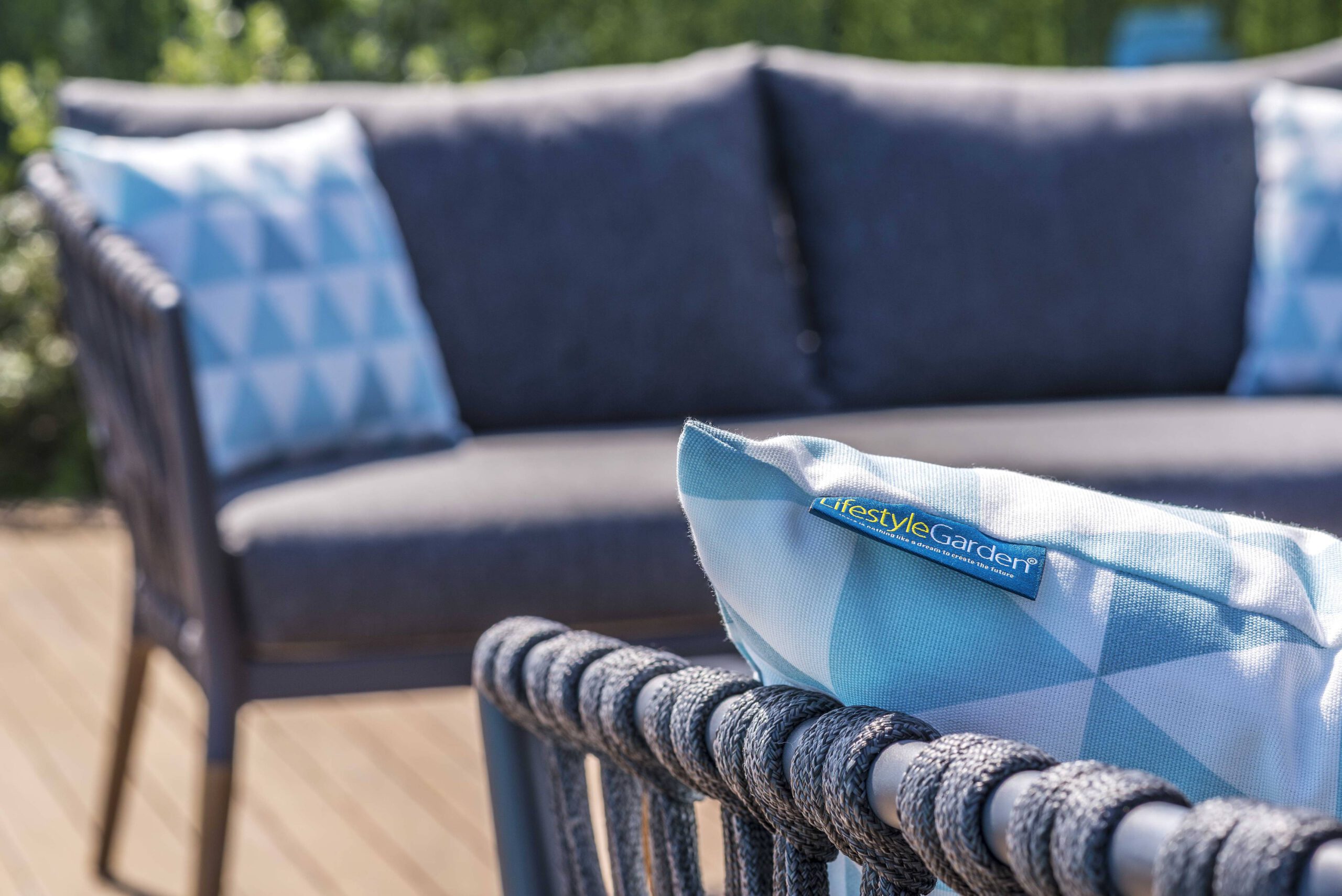
Yellow also connects with the left side of the brain, so splash of the bright stuff – even just a small touch like a vase, wall print or rug – can also help promote creativity. With that in mind, our stunning Nassau chair in Honey would make a welcome addition to your home office. Equally, adding yellow cushions to a chic grey furniture set, like Palau, will provide a stylish area to enjoy a morning cuppa and give you a boost for the day or even a much-needed lift during that afternoon lull.
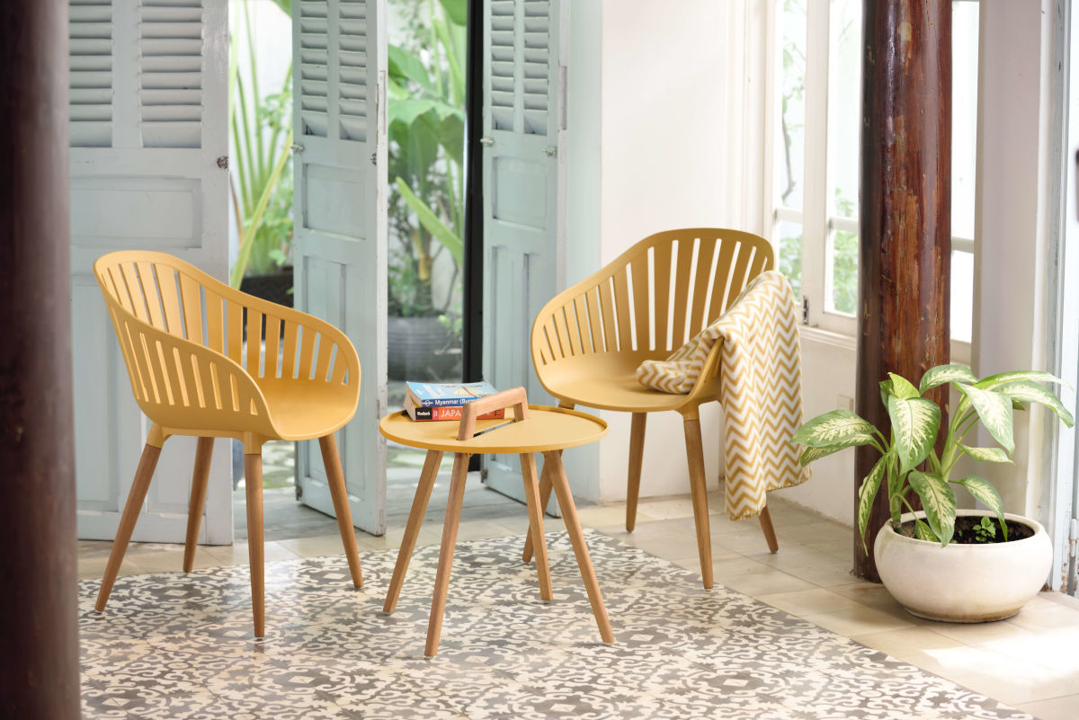
Green promotes renewal, balance and refreshment. It is the colour of nature and growth and symbolises harmony and healing. These things can have a restful, soothing influence so, like blue, could be an ideal colour for a bedroom.
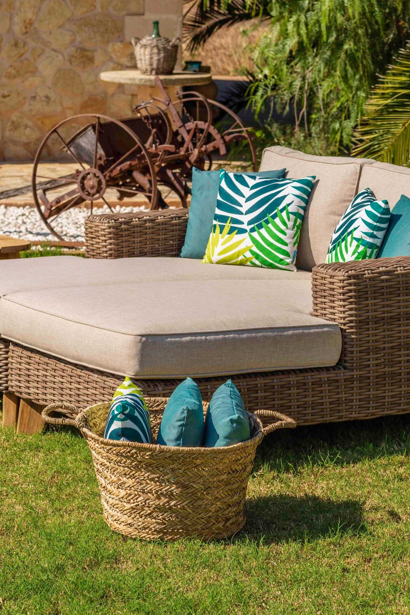
Houseplants and herb gardens are the perfect way to bring green into your home, whilst also helping to improve air quality and allowing you to reap the proven benefits gardening can have on your mental health.
Darker greens tend to be associated with money, wealth and prestige, making them great choices for home offices, show-stopping hallways and reception rooms (you can even use dark green to your advantage by wearing the colour during sales presentations, or in meetings when asking for funding or a loan), whilst lighter greens relate to freshness, rebirth and growth.
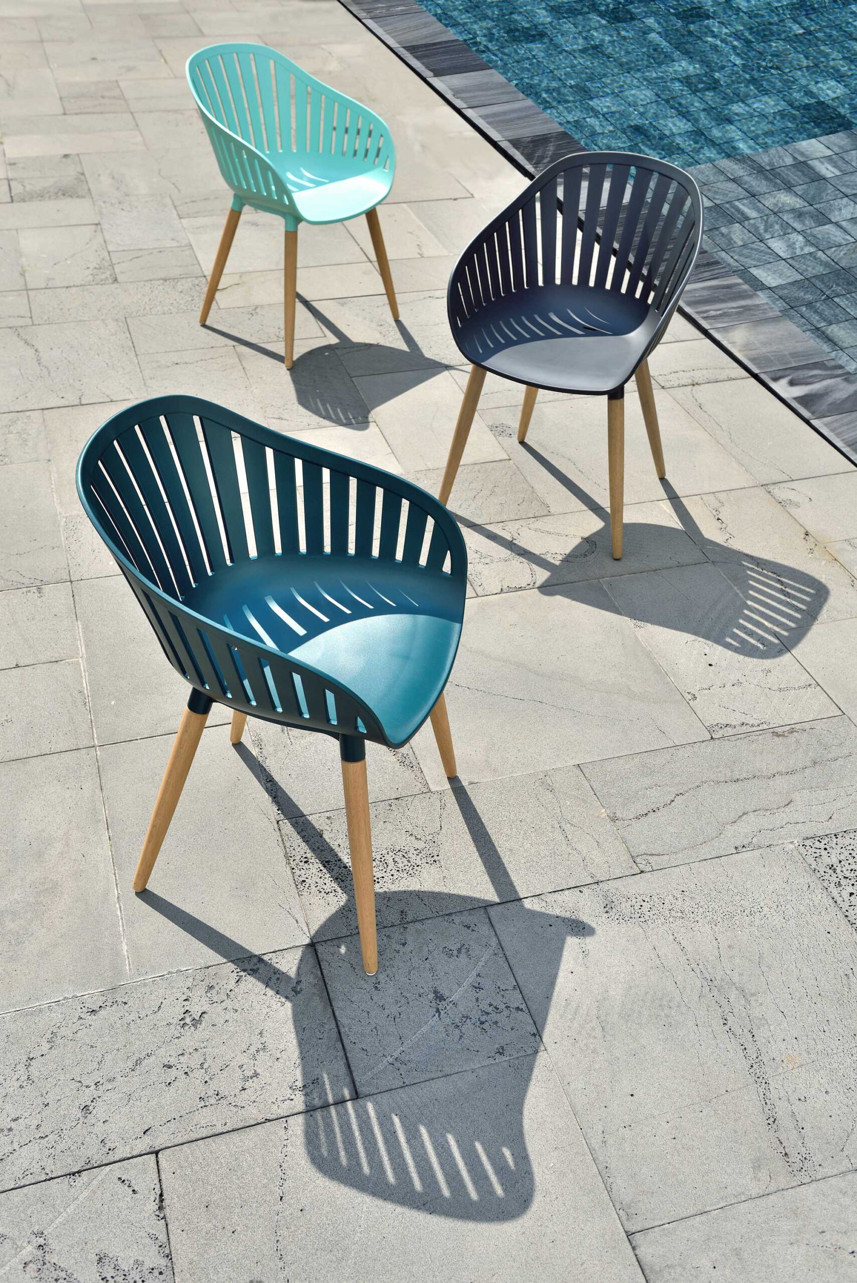
Experts predict that chocolate browns and earthy greens will be popular in homes and gardens next year. In its 2022 colour forecast, paint brand, Dulux incorporates this combination into its Restore palette and says these colours, “provide the reassuring backdrop that allows us to readjust to constant change”.
The natural earthy shades in our Bahamas Collection of furniture will look striking against sumptuous greens in the garden this spring and summer. Add accents of jade, lime, olive, sage, or forest green – depending on the mood you want to inspire – using textiles and home accessories to really bring the look together.
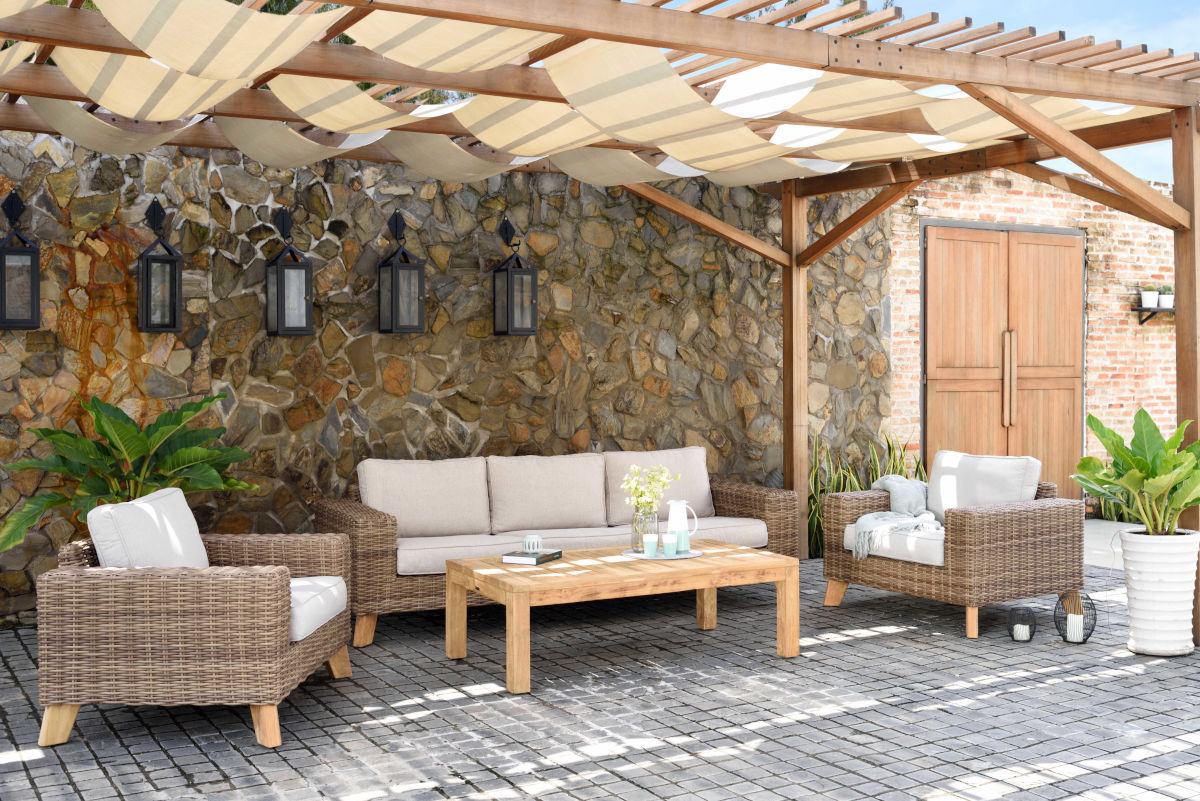
DISCOVER THE BAHAMAS COLLECTION